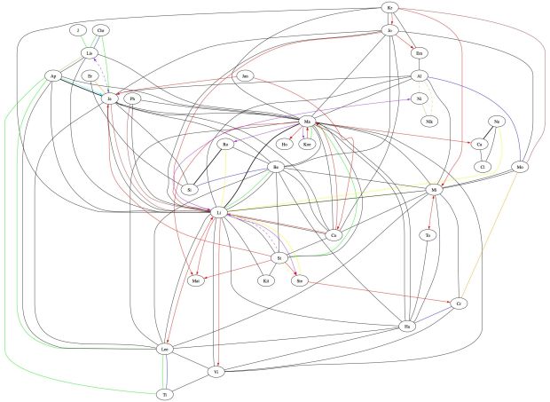
I promise I’ll bring this back to teaching and math, but not in this post. In this post, I wanted to show you something I made a few summers ago with one of my friends. It’s a graphical representation of a social network she’s embedded in.
(Click picture to make bigger.)
Each node is a person.
Each different color/style of line represents a different relationship.
- best friends
- friends
- crush (one person with a crush on another)
- crush (both people have crushes on each other)
- relationships
- hookups
- questionable hookups (meaning: my friend is pretty sure there has been a hookup, but there has been no confirmation)
- kiss
- for sure enemy (this is often only in one direction)
- questionable enemies (meaning: my friend is pretty sure that at least one person secretly hates another, but there is no confirmation)
- broken relationships
- labmates
- roommates
- former roomates
- has a crush but won’t admit it to themselves or others
Admit it. It’s pretty awesome.
This is a prologue to a soon-to-be-written post, but also to let you know of this great piece of software (for macs only — sorry!) that I found to create these kinds of charts, all those summers ago:
It’s pretty fantastic, free, and can do a lot of different types of graphs! So math teachers out there, add this to your exponentially-growing list of “cool internet stuff that maybe I’ll use one day.”

One comment