The images below are thumbnails. Click on the image to see it properly.
ALL 4 SLIDES TOGETHER:
To see the slides individually (click on them to see bigger versions) and read my reflection, jump below the fold.
Slide I:
Slide II:
Slide III:
Slide IV:
Reflection
My mac broke, and so the free design program I learned to use last year (Seashore) wasn’t an option. My school computer came with a program called Fireworks, so I used that. It has a steep learning curve and I’m slow on the uptake, so things were a bit confusing. I have zero art skills, so I decided to let the fonts and statistics do all the work. I used the free program Poladroid to create the polaroid photographs. (The polaroid pictures on my wall were supposed to be from vacations, weddings, and of my friends, but those photos are on my mac — so I couldn’t access them. The pics of me were already uploaded to my digital portfolio, so that’s where they came from. I’m not truly that narcissistic.)
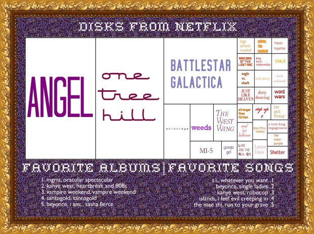
I used Chart Chooser by Juice Analytics to create the two bar graphs. I used many-eyes to create the Netflix chart (the area of each rectangle is proportional to the number of disks ordered… so clearly I watched the entire series of Angel and One Tree Hill, for example). I used my google map for the map of where I went in NYC. I modified the wallpaper to make more space to “hang” the pictures. (Look at the right hand side — I cut a swath of wallpaper and kept on attaching it to the right hand side. It was like hanging wallpaper, getting it to line up pretty well. At least there weren’t any airpockets to eliminate!)
I’m slightly disappointed with this set of slides I made because they don’t tell a story. My slides from last year (2007) told a story — of moving to NYC and changing careers. There was text which explained the stages of my year. This year my slides — hastily done — don’t tell a coherent story. They don’t mention my trip to Paris for Spring Break nor do they talk about the books I read or the cooking I’ve done. They do what all statistics do: box people in and frame issues in particular ways.
(Hence: the frames.)
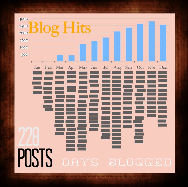
My favorite slide is the one with the blog statistics on it. I was proud of the design. It was also the first one I made. On it, you can see that there has been an upward trend in people reading my blog (though most of them are probably people looking for information on the Richter Scale or Harvard’s Math 55 — two relatively boring posts which get accessed a lot).
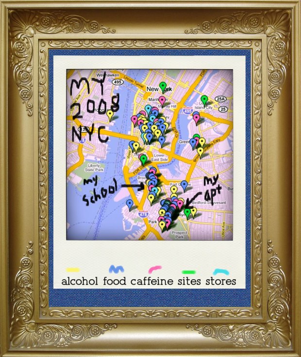
I debated whether to put on my Google Map, but decided that that single image really tells everyone what I do with my time: eat, drink, and caffeinate myself. It also says where I spend my time. Mainly: around home and around school.
The entertainment slide was harder — because iTunes tracks data for the entirety of using iTunes. I didn’t know how to find out my most played tracks of 2008. Hence my decision to put my favorite albums and favorite tracks. They aren’t the most played because many of them are recent loves. You can see I like a lot of upbeat pop and indie rock. I should probably say exclusively. Also I do spend a TON of time watching TV shows from Netflix (I don’t have cable and my antenna doesn’t pick up a good signal). So you can see that on the left hand side of the chart; movies are on the right hand side. I rarely ever see movies in theaters anymore. Design-wise, this is by far my least favorite slide. Too busy.
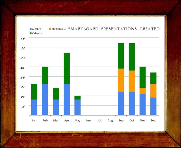
I felt like I couldn’t end without doing something about school. I was going to do something with the insane amount of emailing I do with students (I have a folder for each student, and I save all correspondance to, from, and about a student in that folder). I was going to use that data. But really, the majority of my work at home and time at school centers around SmartBoard. It’s where I do my lesson planning and how I present my lessons. Hence, I decided an accounting of SmartBoard presentations each month would do the trick. You can clearly see three things: I am teaching a new course this year (Multivariable Calculus), I don’t work on SmartBoard over the summer, and there are long breaks during December and March (and review and midterms during January). I was going to put some text on this slide explaining all this, but decided it looked so nice without adding a bunch of junk.
I honestly think the four frames don’t “go” together, and that I should have replaced the top two gold gilded frames with more wooden frames. Maybe have one of them be whitewashed and peeling. But whatever. I had to stop sometime and get back to work.
With that, I’m done.
Creative Commons Images:
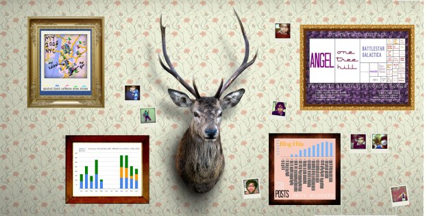


You didn’t answer my immediate question. What’s the story of the mounted deer head? It doesn’t fit with your wallpaper. I miss the continued stories you told last year, but do like idea of framing pictures on a wall.
Other thoughts. I agree that the blog one is the best, but I’m always drawn to maps. (It’s my favorite of Alice Mercer’s as well. But that comments been eaten twice and I’m giving up on it for the night.)
@Sarah: I love the deer head — and I thought it went well! But unfortunately, there was no story, except when looking for antique wallpaper on flickr, this image came up (deer & wallpaper), and thought: wow, I need this! :)
I had the same question as Sarah (“Deer head….?”)
I think you did a great job. I can’t even muster the psychic energy to even think about starting this project now. Plus, this year was just not that interesting. Maybe next year.
Alas for the story. I’m going to pretend that it’s a reminder of your fall hunting trip. (But honestly, I’m not sure I’ve seen a head mounted on a papered wall. Or a painted one. They go in the wood rooms. Think of Gaston’s bar in Beauty and the Beast. Strange designers, you city people.)
Still, overall you’ve done more than I’m likely to. I’m with Kate. Not sure whether I’ll get this done this year or not. We’ll see what next weekend’s like. Or if I get a snow-day in the next week ;-)
I’m impressed that you’ve plotted all those places you’ve been to in Google Maps.
@Simon: I actually use it to remember where I’ve been and what I’ve liked/disliked about those places. I have the worst memory ever.
I like the treemap the best even though I don’t like the border/matting on the slide. Informationally, that one spoke to me the most. The Google Map was cool too. That last bar map is really nice and clean. Not as crazy about the unaligned bar points in slide one. It’s not fitting with the rest of the chart, but I’ve done MUCH more questionable things aesthetically in my preso, so that a matter of taste (which I may be lacking).
Okay, missed the “cover slide” with the deer (reading at work where it was blocked).
Ring me up as pro-antler. The cheesy matting is now making more sense. Context is everything.
A. Mercer Fair point. The matting does make more sense given the larger picture.
At work only the top half of the first picture and one of the actual slides loaded for me. I kept staring at the deer and just wondering what it was.