Our last unit in Algebra II was statistics — and it was a hurried unit. (As last units always are.)
One of the topics I was covering was histogram basics. And I wanted to make it somewhat interesting. So I went online, and came across a page which explained how to understand histograms that your digital camera produces. You know what I’m talking about, right?
That’s the one. How do you get it on your camera? Heck if I know. I just pushed a lot of buttons and eventually the histogram appeared.
Because I had about 20 minutes, I just lectured my kids on how this histogram worked.The histogram has 256 columns (numbers 0 to 255). Each pixel on your camera is assigned a number from 0 (representing pure darkness) to 255 (representing pure lightness). Then the height of each bar represents the number of pixels with that particular level of darkness/lightness.
By that one little piece of information, you can start telling a lot about a photo. Such as when it is over-exposed and under-exposed, and when there is too much or too little contrast. You might wonder how photo editing software can increase the contrast or correct for a photo being over/under-exposed. One you learn about this, the answer is pretty simple. The program reassigns each pixel with a different brightness.
See examples that I cribbed from the website on my smartboard. Pay special attention to how the over-under exposed histograms differ from the “ideal” histogram (and similarly for the too high/too little contrast):
I really enjoyed learning about this, and sharing what I learned with my students. But next year, I want to do something more. I want students to take photos and play with them in some image editing software — and see what happens to the data as they modify the image in certain ways. What does brightness mean? Will things change if the image goes from color to black and white? What does sharpening the image do to the histogram? I want them to talk about mean, median, and mode — and how they change. I want them to talk about standard deviation — and how it changes. I want them to talk about range and shape — and how they change. I want them to make a short writeup explaining their findings.
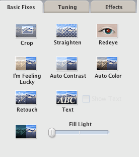
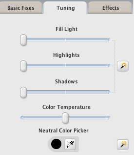
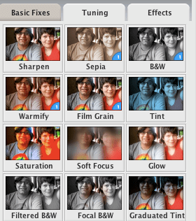
Look at what Picasa (free) offers:
You get the histogram (bottom left)! You also get all these ways to modify the picture!
And the histogram changes as you modify it! In REAL TIME as you slide sliders!
I don’t know quite yet how to make this rigorous or ways to ensure they’re learning. It’s kinda bad, because I just want to play around with this and discover what all these things do myself, not knowing what I want them to get out of it. I just want to explore. I’m not thinking backwards. But I suspect a good short bit on the shape of data can be made from this. (Alternative reading: I wouldn’t begrudge any of you if you, say, went out and made a short unit based on this and sent it to me.)


Sam: This is freakin’ awesome. It’s real enough without obscuring any math. Everyone wants to know what those little bars mean. I think the best way to take this to the next step would be to have each kid ask a really good, testable question and then investigate by taking some controlled pictures, maybe of crayons or something. Imagine the questions they’ll come up with and the math they’ll have to do! Nice work, man, and here I was worried that east of the Mississippi was all beer and lobsters.
=shawn
Ya crushed it, Sam. Furthermore.
Sam,
I love this! I am a big photoshop girl and am going to start playing with the math asap. What a fun way to teach insanely boring mean, median, mode! Thanks! Julie