Month: May 2018

Polar. Graph. Contest.

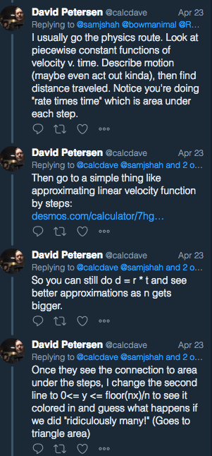
Here’s what I hung up last week:

20180510_175012.jpg

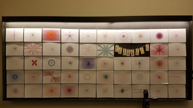
Here’s a closeup of some of them…


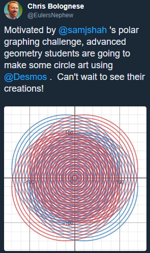
These are polar graphs that students designed using Desmos. Then I printed them out on photopaper and hung them up.

This was something I wanted to do after introducing polar graphing. Why? Because one day during the polar unit, I started playing around with desmos and accidentally created:

pic1

… from something so simple …

pic2

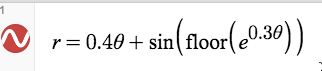
(Now to be fair, desmos isn’t great with creating great complicated polar graphs… and it’s better to write them parametrically to get a bit more accuracy… so this is a bit of a lie of a graph in that it isn’t totally accurate… but it’s oh so pretty.) [1]

So after our unit on polar graphing, I took 10 minutes at the start of class to introduce this idea of a Polar. Graph. Contest. First I threw this image up:

Polar.Graph.Contest..png

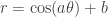
I then pulled up desmos and asked my kids to shout out some polar function. I graphed it. Then I put in a slider or two. So for example, if they said r=\cos(\theta), I might have added the slider r=\cos(a\theta)+b. And then I started changing the sliders. Then I might have altered the function a bit more, like r=\cos(a\theta)+b\theta and we saw what happened. Then I gave everyone 7 minutes to just come up with something pretty.

It was magical.

Kids just started playing. They dug into old functions they had learned about. They got excited by what they were seeing. They gasped and turned their screens to show their friends. Some who were getting boring graphs saw the cool graphs their classmates were getting and were inspired to mix things up since they knew they could make neat things. #mathjoy in the house.

My heart was singing.

Then I showed kids a google doc which had all the info for the contest — and the link to the google form to submit their entries. There were initially two contests. Students needed to create the coolest polar graph with one equation. And students needed to create the coolest polar art using multiple equations. However, some students were animating the sliders and coming up with fun animations (like this or this… watch both for a while). So I added an optional third animated polar graph category.

I haven’t yet told my kids who the winners are. I want to just let them appreciate the work of their classmates for now.

After creating the bulletin board, I’ve seen kids look at the artwork. Kids from my class, but also kids from other grades. And what I’ve found fascinating is that so far, very few kids pick the same polar art pieces as their favorites. I expected everyone to love the same ones I do. But it just isn’t the case. I think when I announce the winners, I’ll have the class go to the board, have everyone point out a few that they like, and then I’ll make my grand pronouncement.

Student Feedback:

I asked my kids, when submitting their artwork, “This is something new I came up with this year. I want to know if you enjoyed doing it or not. No judgments if you didn’t. Y’all tend to be honest when I ask for feedback, and I appreciate it! I genuinely want to know. I also am a bit curious if you had any mathematical thought as you were playing on Desmos? You don’t have to say what thoughts you had (if any) — just if you had any.”

Every student responded positively. Some responses included:

  • I think this was so awesome! I love art and this felt like art to me. It is so fun when art and math intersect, I loved it!!!!!
  • Messing around with the graphs was actually more entertaining than I thought it would be. I spent a lot more time on this than I thought I would, and I feel like I’ll probably spend more time on this trying to find a really cool design I like (and possibly gaining a better understanding why the graphs look the way they do…).
  • I had so much more fun doing this than I thought I would, honestly. Once I finished my multi-equation graph, I looked at the clock on my computer and realized I had been working on it for nearly 20 minutes; it had seemed like maybe 5.
  • I really enjoyed doing this assignment. I felt that I learned a lot about polar through it. I didn’t think too much about math while making my graphs, however I thought about math a lot in order to observe and think about patterns I found in my graphs.

Now I want to be frank: there isn’t much “learning” that happens when kids are doing this assignment. This isn’t a way to teach polar. But it is a way to get kids to appreciate the power of polar when they are done working with polar, and what sorts of different kinds of graphs compared to the boring ol’ rectangular coordinate system. I just wanted kids to play, like I played, and get excited, like I got excited. It’s a slightly different way to appreciate the power of math, and I am good for that. Especially since it only took 10 minutes of classtime!


As an aside, I love that when I tweeted this out, a tweep said he was going to be doing this in his class after his kids learn about circles. Um, hell yeah!

Circle.PNG


[1] So there are two ways to graph polar in desmos. First is the straight up polar way, and the second is the parametric way. It turns out that the polar way is solid for most things, but it loses refinement at times. Let me show an example. If we graphed r=\cos(57\theta), we should get a flower with 57 petals.

And happily, if we graphed it in both polar and parametric, we get the same looking graph:


However if we zoom in a bunch, we can see that the red graph (the polar equation) is interesting and stunning, but just isn’t correct. While the zoomed in blue graph (the parametric equation) is more boring, but is technically correct.


It turns out desmos samples more points using parametrics than polar.

As a result, a few of the polar artworks my kids made aren’t “true.” Their pieces are a desmos quirk, like the red graph is above. But what a lovely desmos quirk.

Part II: Transition from Anti-Derivatives to Integrals

In my last post, I outlined the road trip scenario I used to prime kids to think about areas under curves. It had nothing to do with anti-derivatives. And that’s important to keep in mind. This post is going to try to outline how we made the intellectual leap from areas under curves to anti-derivatives. [Update: I wrote this during 40 minutes of free time I had in school today where I didn’t want to do other things I was supposed to be doing. So I didn’t get to writing the part of the lesson where we make The Leap. This post ends where we’re literally all primed to make the leap. But indeed! I will make the leap with you! But in Part III. Which will be written. Soon. I hope.]

The road trip introduced this idea that kids can approximate how far someone traveled using a left-right-midpoint Riemann Sum approximation (we did not give it that name…). It arose naturally from the roadtrip scenario.

2

We also made the conclusion that if we had more data, we could get a better approximation for how far someone traveled. To remind you, we started with this data:

time1.png

and then we got more data:

time2.png

That’s going to be our transition. We are now going to give infinite velocity data! [1]

pic1.png

Wonderfully, kids had no problem with doing this. The reason I highlighted question 1c is because I was very intentional about including that question. When students graphed 1e, they often would draw:

pic2.png

I didn’t correct anyone while they were working. And it was nice to hear a few groups have the requisite conversation about why we needed to connect the points. Afterwards, when we debriefed as a whole, this was something I highlighted. We knew the position at every moment in time, including at t=2.31 (as asked in 1c).

Kids continued on with Questions 2, 3, and 4. They flew through these, actually.

pic3pic4pic5

These were golden. Let me say that again: these were golden. [2] It was amazing to watch kids:

  • Parse the connection between velocity graphs and position graphs
  • Understand the idea of negative velocity
  • Think about the fact that we have to specify an initial position in order to create a position graph
  • Draw a connection between motion on a number line and a graph of position v. time
  • Understand what distance and displacement are, and see the difference between the two

Seriously, just watching kids work through these problems was… well, I’ll just say this feels like something I’m super proud of creating. It didn’t take much time to do but gave us so much fodder.

We didn’t need a lot of time to debrief these four questions. I had students highlight a few things, and I made sure we brought up the fact that we were drawing line segments for the position graphs, and not something curvy. Because constant velocity means position is changing at a constant rate, it’s linear. So for example, the position graph for 3c would look like what I have below. It isn’t a parabola.

pic11.png

But there was one huge thing we had to go over. With the roadtrip, we drew a connection between area and how far someone went. Most kids, as they were doing these problems, didn’t think about area. I wanted kids to think about area. So in our debrief, I explicitly asked them what our huge insight from the roadtrip was (area as distance travelled!), and if we could apply it to one of the problems.

So first I went back to question 2c. And I asked students how they calculated their answer:

pic6.pngKids said she went backwards a total of 24 units. So they did 100-24. And then I explicitly had them draw the connection to what we did with the roadtrip. This is when we talked about it being area, but “signed” to represent the backwardsness.

pic7.png

To be clear, some students had already been thinking in this way (about area/signed area) when working on these problems. But most hadn’t been, so we had to bring that idea to the forefront.

Then I had a student talk through Question 3 with areas in mind:

pic8.png

And finally, I asked groups to discuss how we could understand distance and displacement from the velocity graph.


There is one more part to this packet I had my kids work on that I will outline in my next blogpost in the series! But here’s an editable .docx of the file I made [2018-05-02 Velocity Graphs]. And here’s the document to view here:

Stay tuned for Part III.


[1] Both @calcdave and I stumbled upon the same approach for this!

[2] The only note is that a few students didn’t realize the time interval was 1/2 hour for Question 4. And it involves a fair amount of calculation.


Part I: Transition from Anti-Derivatives to Integrals

An Important Prelude: On one of the early days in my calculus class, I have groups imagine a roadtrip. It’s one of the very best things I do, because it problematizes the idea of how something can be going at a particular speed at a moment in time. Like a speed involves a rate of change of position in a time interval, but we don’t have a time interval at a moment in time. So saying something like “we were going at 58mph at 2:03pm” suddenly goes from a statement kids accept to a problematic statement. And at that moment, we’re ready for calculus.

Setting the Stage Now: In calculus, I had gotten my kids to take tons of derivatives, and then taught them about antiderivatives and how to take them. But of course the whole time they were doing antiderivatives, they were asking “but why are we doing this?” I got this question a few times, but I just said “you’ll see very soon… probably next week… I just want to get some of this algebraic thinking out of the way so we can focus on concepts.” [1]

The Problem: I looked back at what I’ve done in the past about how to draw the connection between the antiderivative and signed areas together, and had a bunch of pretty terrible methods. I didn’t like any of them. So I put out a call on twitter while brainstorming myself. [2] I got a ton of responses, three of which stood out to me. The first one is something I kinda did at the start of the year already (before we did any calculus), so I’m excited for when my kids see the connection…

tweet1.png

The second came was from the appropriately named @calcdave:

tweet2.png

What’s incredible is that when I tweeted out asking for help, I had already started brainstorming … and it was so amazing that we had such similar ideas that I had to take a photo of my scratch work to send David:


I also got a DM from Brett Parker (@parkermathed) with a screenshot of how he digs into the idea. And what was his idea?

tweet3.png

Yup. Driving in a car. Which of course got me thinking of the start of the year when I basically transitioned to derivatives using a road trip.

What I did: Part I

So I told kids we were going to put a pin in anti-derivatives for a short while to go on a short detour. And I used Brett’s setup, but changed it to be a followup from the roadtrip we had talked about earlier this year. We read the setup together, and then I gave each group a few minutes to talk about part (a).

sheet1
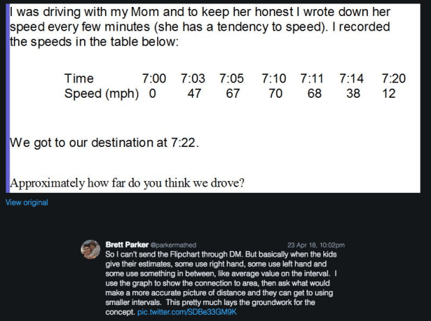
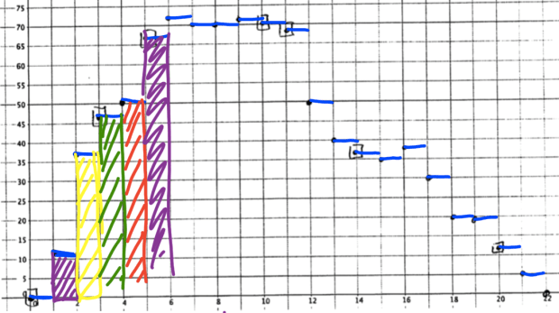
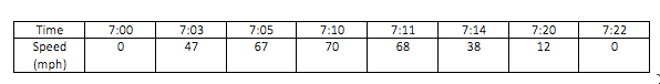
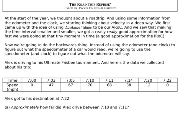
Surprisingly, this was not an easy question for kids. Many didn’t instantly think distance=(rate)(time). Additionally they didn’t know what assumption to make about the speed for the minute that passed between 7:10 and 7:11. I emphasized the approximate part of the question, and really told kids they would need to make an assumption.

When we debriefed, most kids suggested Alex was probably driving 69mph for the minute, so they did 69\cdot\frac{1}{60}.

Some suggested he was maybe going 70mph for most of the minute, so they suggested 70\cdot\frac{1}{60}. And with that, I suggested that maybe he was going 68mph for most of the minute… We did the calculations for all three and saw they were pretty similar.

notes1.png(We also had discussed that in that minute, perhaps Alex started at 70mph, went to 100mph, and then slowed down to 68mph… We just didn’t know. So we were making and using an assumption, but one that is pretty reasonable.)

Then kids in their groups went to the next three parts. And each group was assigned an assumption: average speed, left hand speed, or right hand speed.

Sheet2.png

The only errors I saw kids make in part (b) was not taking the different time intervals into account. Since we did one example which had a time interval of \frac{1}{60} 
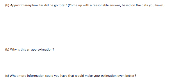
hour, some groups were using that time interval for everything. But pretty rapidly most kids got there.

notes2.png

In our debrief, I wrote out the calculation kids did for the left hand assumption, and then asked students what I would have to change to do the calculation for the right hand assumption. (That was written in yellow.) This question was a key question to ensure kids understood the difference.

Then we talked why this was an approximation? (We had to make assumptions about the speed of the car at all the times inbetween the times we were given.) And then kids said that to get a more accurate distance for Alex, we’d need more data.

And that’s precisely what they got when they flipped the sheet over.

sheet3.png
I assigned some groups the left hand assumption, and some groups the right hand assumption. I thought with so many data points, kids would be like “argh! I have to do all these calculations!” But no, there were no audible groans (I don’t think…) And they plotted the points and then did the calculations. I told kids to write out all their calculations instead of just saying how far Alex drove in the first minute, the second minute, the third minute, etc. No everyone listened. Shame. They lost out. Because when we debriefed, we saw:

notes3.png

Yup. The fact we could factor out the 1/60th is key. It made this all go so much faster. Only a few kids noticed that when doing the calculations. And then we compared that with the right hand assumption:

notes4.png

The same answer! Why? Kids saw that the sum inside the brakets (after factoring out the 1/60) would be the same because the starting speed and ending speed were both the same.

So we’re done, right? NO. We had two more moves to make.

First, we looked at the graph.

sheet6

And I asked: “if we were doing the left hand assumption, what would our velocity graph look like?” And we concluded that for each 1 minute interval, Alex was driving at a constant rate. So it would look like this:

notes5

Second, I asked: Between 7:05 and 7:06, how much are we assuming Alex went? (Kids answered 67\cdot\frac{1}{60}
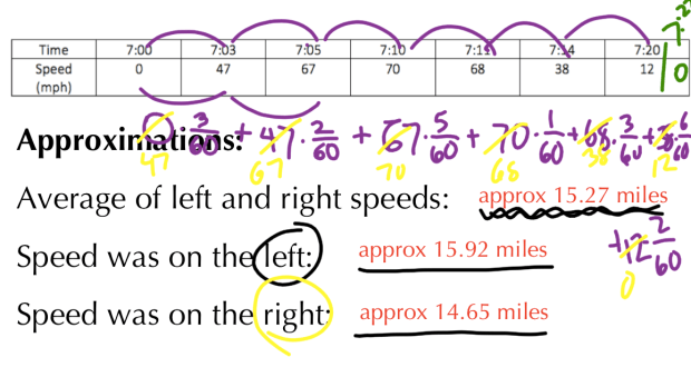
) Here’s where I did some talking. I could probably have asked kids to think geometrically and had them come up with this, but I was running out of time.

I said: “where do we see 67 represented on this graph?” (Kids said the height of the velocity graph from 7:05 to 7:06.) I then said: “where do we see the \frac{1}{60} on this graph?” (Kids said the 1 minute length.) So I drew a rectangle. Slowly. And then shaded it in. Slowly. And turned around. Slowly.

1

Yes. Audible gasps from many. I then said: “What about 7:04 to 7:05? What was our calculation for the distance Alex traveled?” And after a few more, we saw:

2

Kids saw. Heck yeah. They got that the approximate distance that Alex traveled was algebraically calculated in one way. And then they saw that number had a graphical representation. It was awesome.

I left by showing the original velocity points graphed. Reminded them of our left hand assumption, and that it was just an assumption, though a pretty good one. And then I drew the curve below. And dropped the microphonic device and left.


All in all, this was a pretty detailed blow-by-blow. And since I did it in two different classes, and things unfolded slightly differently in each, this is an amalgam of what happened. But it’s a pretty solid recap of the story I wanted to tell and how it was told. (And it’s a testament to the help of my (twitter) frands.) Most of the time, students were working. But a lot of great conversations happened as a whole class. It is a long post, but the question we worked on was only one page [editable version to download: 2018-04-30 A Road Trip Reprise] And it probably only took 20 minutes total from start to finish. A really exciting 20 minutes for me.

Stay tuned for how I used the idea that @calcdave and I both stumbled upon to make the connection between area and anti-derivatives. Right now kids have seen that there is a connection between area under a velocity curve and the distance someone has traveled. There is still no connection to anti-derivatives. That’s coming up.

[1] To be honest, I made the decision years ago to do tons of antiderivatives before introducing the integral. I wanted all the algebraic work done and solid before we introduced the concept of the integral. I didn’t want kids messing with the idea of signed area, new notation, and tough antiderivatives all at the same time. I still kind of think this is the right decision, but some doubts have crept in. I just really hate when I have to say “you’ll see why… promise…”

[2] Apparently I asked this on my blog ages ago in 2009.