So I’ve comfortably slid into the new year. I can’t say the transition has been all laughter and involves me skipping and trololo-ing. There’s an energy drain that comes when you have to be “on” all the time — and it’s no truer than at the start of the year. If you’re me, you’re on hyperdrive, being very purposeful in what you do and say, because you know that this is when you’re building your reputation with your class. (Just as kids are building their reputation with me, by what they do and say.) And that is the most important thing for me at the start of the year. I want them to see what I value, but enacting it.
Yesterday I had one of my favorite teaching moments. One of my students, who I happened to have taught in a previous year also, said when she arrived to class: “When I realized I had to leave for class I started singing I’m off to see the wizard, the wonderful wizard of Shah.” I heart my kids so much, because… well, I just do. They’re awesome. I promise if they come to me saying they don’t have a brain (“I am just not a math person”) that I will give them a brain (because isn’t that what wizards do?). I will also give them courage (pronounced coo-raj like the french) and confidence. At least I will try.
Our school mascot is the Pelican (ferocious! fierce! or not…) and I want to feel like this at the end of the year:

Honestly, I feel like I’ve been doing a pretty good job in some areas and a crusty job in others.
Rational Functions in Calculus
Example of a crusty job: In calculus I am teaching rational functions to prepare us for limits. I am really focusing on getting kids to understand why. In particular, I’ve been working on getting ’em to understand what a hole truly means, and what a horizontal asymptote means (and no, it is NOT a line a function gets closer and closer to but never touches) and why they might arise. The problem is that this sort of work is hard and takes time and my approach just wasn’t super effective. It was too me-centered, and I didn’t design a way for them to grapple and discover… instead I just kinda gave and explained, in the guise of student questioning.
Still I did get one amazing question which I have to type here so I can use this to provoke discussion and investigation in a class next year…
Why is it that holes appear at the x-value that makes the numerator and denominator of a rational function equal 0, but vertical asymptotes appear at the x-value that makes the numerator non-zero but the denominator 0?
And then to muck them up, after we come to some sort of understanding, I will ask a follow up question:
Graph  . At
. At  , you have
  . You’d expect that to be a hole, but … SHOCK! GASP! EGADS! … ’tis not. Explain.
(This came up in one of my classes, and it was precisely at that moment I realized how deep and complicated rational functions are, and how they are just blind algorithms to my kids. I hate that students use procedures and rules to memorize how to find x-intercepts, holes, horizontal asymptotes, etc… but that’s how we teach ’em so I shouldn’t expect any differently.)
I wonder if I asked students in AP Calculus BC to explain why  has a hole at
  , could they give a comprehensive answer that doesn’t rely on the fact that “a factor cancels from the top and bottom”? I’d bet not. That makes me sad. I don’t want to be sad.
This is good stuff. I could have introduced it and had my kids muck around with it in a more meaningful way.
The other hard thing that I’m finding, as I really really highlight why, is how much longer things take. I’m okay with it, because I’m not teaching to an AP exam. But it’s a change I have to get used to and honor, but that’s not going to be easy for me.
I have a couple great concept questions on tomorrow’s calculus assessment, so we’ll see if all our discussions about these things have actually made an impact on student learning.
WHY?
Today in one of my Algebra II classes, I used an exit card. We briefly went over why — when working with inequalities — you “flip the direction of the sign” when you multiply or divide by a negative number. I waited a day or two, and then I put the following on an exit slip for them to fill out at the end of class:

I am unsurprised by what I got back. About 1/3 of the kids said “you only switch the direction of the inequality when you divide by a negative number, so matt is wrong.” Almost all of the rest said “when you divide or multiply by a negative number you switch the direction of the inequality.” Only two actually got close to a meaningful solution.
So why am I unsurprised? Because this kind of explanation is new for them. They really haven’t been asked — at least not on a regular basis — to justify their reasoning. It’s a procedure. They “think” they understand it, but when probed, they don’t. Also, more importantly, I’ve realized they have no idea what the word “why” means in math. They think stating the rule is the why. It’s become clear to me in the past year that they don’t know that when I ask them why, I am not asking them for the rule but for the reason for the rule.
The great thing is: this was formative assessment. Without it, I wouldn’t have known that about 1/3 of the kids didn’t even fully know the “rule” for inequalities. And that those kids don’t see that multiplying by -1 is the same as dividing by -1. I also wouldn’t be able to talk specifically with them about what why means in math, and what a comprehensive explanation might look like.
Last year I put concept questions like this one on tests, but that was problematic. Kids usually did poorly on them, and they wouldn’t have a chance to really revise their response because their grade was fixed (I don’t do SBG in Algebra 2). So the feedback loop was stunted: kids saw their score on these kind of problems, they quickly read the comments, and never revisited it.
(I should also say that we did talk about these sorts of concept questions during the lessons too — they weren’t just sprung on them at the time of assessments.)
I’m in debate how to follow this up, after I have my in-class conversation with my kids. Right now I’m leaning towards making a graded take-home “paper” where students answer this question as comprehensively and clearly as they can. And if they want, after I comment on it, they can revise and resubmit. This closes the feedback loop. And I figure if I do this a few times early in the year, I’ll get dividends later on.
Emails!
I always have my kids fill out an online google docs survey at the start of the year. It has logistics (e.g. do they have the book yet? what’s their graphing calculator’s serial number?), but it also asks them some questions about their thoughts on math, their hopes and fears, anything else they’d like me to know, whatever. It’s really useful because you get, with a few questions, exactly the things you need to know in order to start getting to know your kids as math learners (and as people, yadda yadda, blah blah).
In previous years I wrote special emails only to students who said things in their survey that I thought needed a response. Like a student sounding especially nervous about class, or who has a learning difference and wants me to know what sort of things work well for them. However, this year I decided to respond to all surveys. I have already done all my calculus students, and I hope this weekend to get my Algebra II students done too. It takes a surprisingly long time to do it, but I enjoy it. And I hope this is one of those small things that I do that shows these kids, who barely know me, that I care about them and that I’m going to be listening to what they say.
Integrity
Tomorrow is the first calculus assessment. It’s only a 20 minute thing (I’ll let ’em have 30 minutes though…). Beforehand, I’m going to talk with ’em about integrity. I tend to overplan things, but I want this to be a more spontaneous discussion that revolves around the ideas of respect and trust. So in opposition to my own inclinations to overthink this, I’m going to wing it in the hopes that it will be more powerful that way. Then I’m going to start ’em on the test, and leave the room for about 10 minutes. (I won’t be far, because we’ve been having lots of firedrills.)
And yes, like last year, I’m going to continue to have my kids sign these integrity statements. (And I even have another teacher doing it also!)

It’s not that I think it will stop cheating. But I do think that talking and reminding them about it semi-frequently, they at least know that integrity means a lot to me.
With that, I’m done. I’ve almost finished our first full 5-day week of school. Huzzah!


 has a graph that looks like:
 , and the graph looks like:
 (obviously).
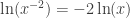 . But the graphs are different.
 .
. . This was a good reminder for us.

 is 2, clearly it means the limit is 2.5.” (WRONG.)
 . I’m confident that by the time I’m done with them, my kids will get
  .
. is at most equal to 1, so
  . Since logarithms of negative numbers cannot be defined, the value