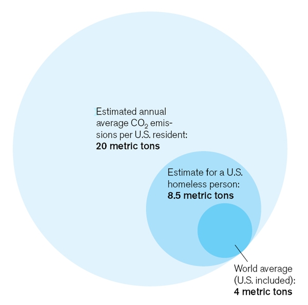
I love the MIT magazine Technology Review. This month’s issue had the following diagram in it, associated with an article about carbon footprints:
Anyone else see the problem? And anyone else see a teachable moment?
If you don’t see it, think about the data. You’re saying the World Average is 4 metric tons, the US Homeless Person is 8.5 metric tons, and US Resident is 20 metric tons. In any representation of the data, the US Homeless Person should be a bit less than twice the World Average. And the US Resident should be five times the world average.
Now look at the picture. Does that diagram represent that?
Put it another way: can you fit exactly five of the small circles in the largest circle?
(No.)
The diagram is misleading because you look at it and naturally compare areas. But unless you give it more than a glance, you won’t notice that the numbers (4.5, 8, 20) actually are the radii of the circles!
This could be the hook for a geometry or Algebra I class (on proportions, on circles, on data analysis). A teacher could then to parlay it to a discussion of how to “fix” the problem…
I see two easy solutions:
- Make a bar graph (boring solution)
- Make the same bubble graph, but make the radii
,
, and
respectively (more fun solution)
In coming up with the second solution, students will think about areas, proportions, and visual representations of data. I can see students each approaching and solving the problem slightly differently, but still getting the same answer. In that sense, it allows for some grappling and struggle.
I still love the Technology Review. Not only is it full of good reads, but good ideas for lessons!
Look below the jump for a revised graph, which accurately represents the data…
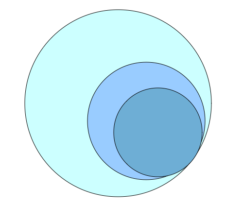
[Created in 5 minutes using Microsoft Word… I used AutoShapes to draw a circle. I right clicked to “Format AutoShape” and set the size to the radii I wanted… and finally, in the same menu, I changed the color of the cirlce.]

This is a classic.
I suggest reading Tufte’s The Visual Display of Quantitative Data for more. Despite the dry title, it’s one of my “must have” books.
Ah, I bought that and two other Tufte books for my undergrad adviser (he worked on history of science and visualizations). But I never got around to getting myself a copy! But now that I have end-of-school barnes&nobles gift cards, you’ve inspired me to get it… (and the card game “SET”).
Thanks!
I’m adding this blog entry to my website (if you don’t mind) I try to show students how the media uses the display of data to sway us but this one really isn’t a fair way to show the data!
Thanks!
Of course! Thanks!
Nice post. A few more examples of *how to visualize things in a _wrong_ way* are present in a documentation for PGF, a great (La)TeX package for authoring graphics. Let me google a bit for the manual… I’ve got it, it’s here: http://www.ctan.org/tex-archive/graphics/pgf/base/doc/generic/pgf/version-for-pdftex/en/pgfmanual.pdf. See the chapter on “Guidelines on creating graphics” (or something like that). (Indeed, I would *never* use M$ Word for that kind of stuff – LaTeX + pgf is sooooo much better, and sooooo much more fun to use!)
Very Tufte-esque, as Mr. K points out. I’m saving this one for use in our Quantitative Reasoning course where we deal with how graphical images can be used to distort information.