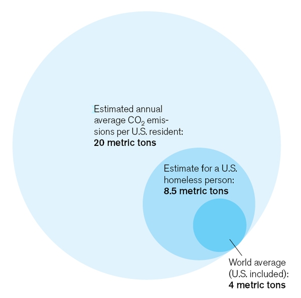
I love the MIT magazine Technology Review. This month’s issue had the following diagram in it, associated with an article about carbon footprints:
Anyone else see the problem? And anyone else see a teachable moment?
If you don’t see it, think about the data. You’re saying the World Average is 4 metric tons, the US Homeless Person is 8.5 metric tons, and US Resident is 20 metric tons. In any representation of the data, the US Homeless Person should be a bit less than twice the World Average. And the US Resident should be five times the world average.
Now look at the picture. Does that diagram represent that?
Put it another way: can you fit exactly five of the small circles in the largest circle?
(No.)
The diagram is misleading because you look at it and naturally compare areas. But unless you give it more than a glance, you won’t notice that the numbers (4.5, 8, 20) actually are the radii of the circles!
This could be the hook for a geometry or Algebra I class (on proportions, on circles, on data analysis). A teacher could then to parlay it to a discussion of how to “fix” the problem…
I see two easy solutions:
- Make a bar graph (boring solution)
- Make the same bubble graph, but make the radii
,
, and
respectively (more fun solution)
In coming up with the second solution, students will think about areas, proportions, and visual representations of data. I can see students each approaching and solving the problem slightly differently, but still getting the same answer. In that sense, it allows for some grappling and struggle.
I still love the Technology Review. Not only is it full of good reads, but good ideas for lessons!
Look below the jump for a revised graph, which accurately represents the data…


