This post refers to the pendulum lab I recently posted about. I had my students collect data, and this is what they got:
| Length (inches) | Period (sec): Group I | Period (sec): Group II |
Period (sec): Group III |
Period (sec): Group IV |
| 60 | 2.57 | 2.57 | 2.49 | 2.50 |
| 54 | 2.36 | 2.38 | 2.34 | 2.50 |
| 48 | 2.31 | 2.29 | 2.17 | 2.23 |
| 42 | 2.16 | 2.06 | 2.03 | 2.09 |
| 36 | 2.07 | 1.96 | 1.86 | 2.00 |
| 30 | 1.82 | 1.89 | 1.77 | 1.79 |
| 24 | 1.64 | 1.67 | 1.64 | 1.63 |
| 18 | 1.44 | 1.43 | 1.42 | 1.39 |
| 12 | 1.12 | 1.14 | 1.12 | 1.16 |
| 6 | 0.86 | 0.83 | 0.87 | 0.78 |
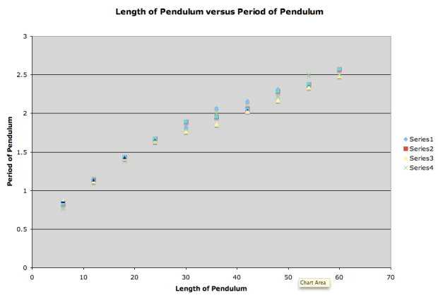
The data was pretty consistent among the various groups. Remember we did this lab in the context of parabolas. However, when the groups plotted their results, they were getting:
What?! The data doesn’t look quadratic. If anything, it looked to us like a square root or a quadratic with a negative coefficient. We used our calculators to do a quadratic regression, and got (for one set of data):
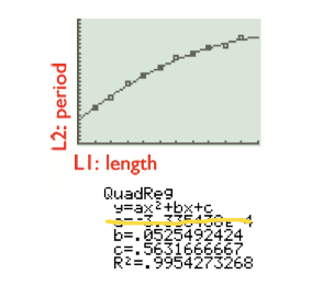 I tricked my class into believing this was a good model. I mean, look at it! The parabola fits the data so well!
But then we looked at the coefficient and saw it was negative and nearly zero. And then when we expanded our domain, we got:
It was at that point that students saw how our model sucked. Because they said that if we increase the length of the pendulum, the period should increase too.
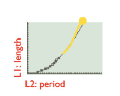
So we went back to the drawing board. I suggested that we plot period versus length, instead of length versus period. (Next year I’m going to have us discuss this idea more — the swapping of x and y coordinates, and how something that looks like a square root might look like a parabola if we do that. Because of timing issues in this class, I just told them that was what we were going to try. Sigh.)
And we did, and found the quadratic that modeled it, and saw:
And then we extended it to see that if we increased our period, if the length would increase too…
It does! It makes conceptual sense too! (We also talked about whether it should hit the origin and why our model does or does not hit the origin.)
With our newfound analysis, I had students answer the following question based on their “good” quadratic model (in our case above: ):
(a) If your pendulum has a period of 1.5 seconds, estimate the length of the pendulum.
(b) If your pendulum has a period of 20 seconds, estimate the length of the pendulum.
(c) If your pendulum has a length of 10 inches, estimate the period.
(d) If your pendulum has a length of 1,200 inches, estimate the period.
What is nice is that (a) and (b) just involve students plugging in and
into their model. And all the groups got very similar answers for the first length, and really different answers for the second length. So we got to have a short (I wish it could have been longer) discussion of why that is so. (We talked about interpolation versus extrapolation.)
And then (c) and (d) involved students solving a messy, real world quadratic because they’re setting and
. The same thing that happened in part (a) and part (b) happened in part (c) and part (d); all the groups got very similar answers for the first period, and really different answers for the second period.
What we didn’t get to talk about, unfortunately, is the theoretical answers, based on physics. The formula for the period of a pendulum is where
,
, and
are in standard metric units. So I was hoping we’d get a chance to do some unit conversions to see how our experimental data relates to to theoretical data.
I did get to show my students how their values compared with the theoretical data:
| Length of String | Group 1 | Group 2 | Group 3 | Group 4 | Theoretical |
| 60 | 2.57 | 2.57 | 2.49 | 2.50 | 2.48 |
| 54 | 2.36 | 2.38 | 2.34 | 2.5o | 2.35 |
| 48 | 2.31 | 2.29 | 2.17 | 2.23 | 2.21 |
| 42 | 2.16 | 2.06 | 2.03 | 2.09 | 2.07 |
| 36 | 2.07 | 1.96 | 1.86 | 2.00 | 1.92 |
| 30 | 1.82 | 1.89 | 1.77 | 1.79 | 1.75 |
| 24 | 1.64 | 1.67 | 1.64 | 1.63 | 1.57 |
| 18 | 1.44 | 1.43 | 1.42 | 1.39 | 1.36 |
| 12 | 1.12 | 1.14 | 1.12 | 1.16 | 1.11 |
| 6 | 0.86 | 0.83 | 0.87 | 0.78 | 0.78 |
I think they were impressed, though I didn’t get the ooohs and aaahs I was hoping for. I’ve plotted the theoretical (purple) with the actual data (yellow) so you can see how good the experiment was. I am not plotting it on a period versus length graph, though if I were to show my students, I would do that because that’s the way we analyzed the data (we got a parabola).
And with that, we finished our lab.
