When I put out my call for help with Project Based Learning, I got a wonderful email from @gelada (a.k.a. Edmund Harriss of the blog Maxwell’s Demon) with a few things he’s done in his classes. And he — I am crossing my fingers tight — is going to put those online at some point for everyone. To just give you a taste of how awesome he is, I will just say that he was in NYC a few years ago and agreed to talk to my classes about what it’s like to be a real mathematician (“like, does a mathematician just like sit in a like room all day and like solve problems?”), and have kids think about and build aperiodic tilings of the plane.
Anyway, he sent me something about families of curves, and that got my brain thinking about how I could incorporate this in my precalculus class. Students studied function transformations last year in Algebra II, and we reviewed them and applied them to trig functions. But I kinda want to have kids have some fun and make some mathematical art.
First off, I should say what a family of curves is.

That’s from Wikipedia. A simple family of curves might be  which generates all the lines that go through the origin except for the vertical line.

I made this in Geogebra with one command:
Sequence[k*x, k, -10, 10, 0.5]
This tells geogebra to graph for all values of  from -10 to 10, increasing each time by 0.5.
Okay, pretty, but not stunning. Let’s mix things up a bit.

Sequence[k*x+k^2, k, -10, 10, 0.1]
Much prettier! And it came about by a simple modification of the geogebra command. Now for lines with a steep slope, they are also shifted upwards by  . This picture is beautiful, and gives rise to the question: is that whitespace at the bottom a parabola?
Another one?

Sequence[1/k*sin(k*x),k,-10,10,0.2]
And finally, just one more…

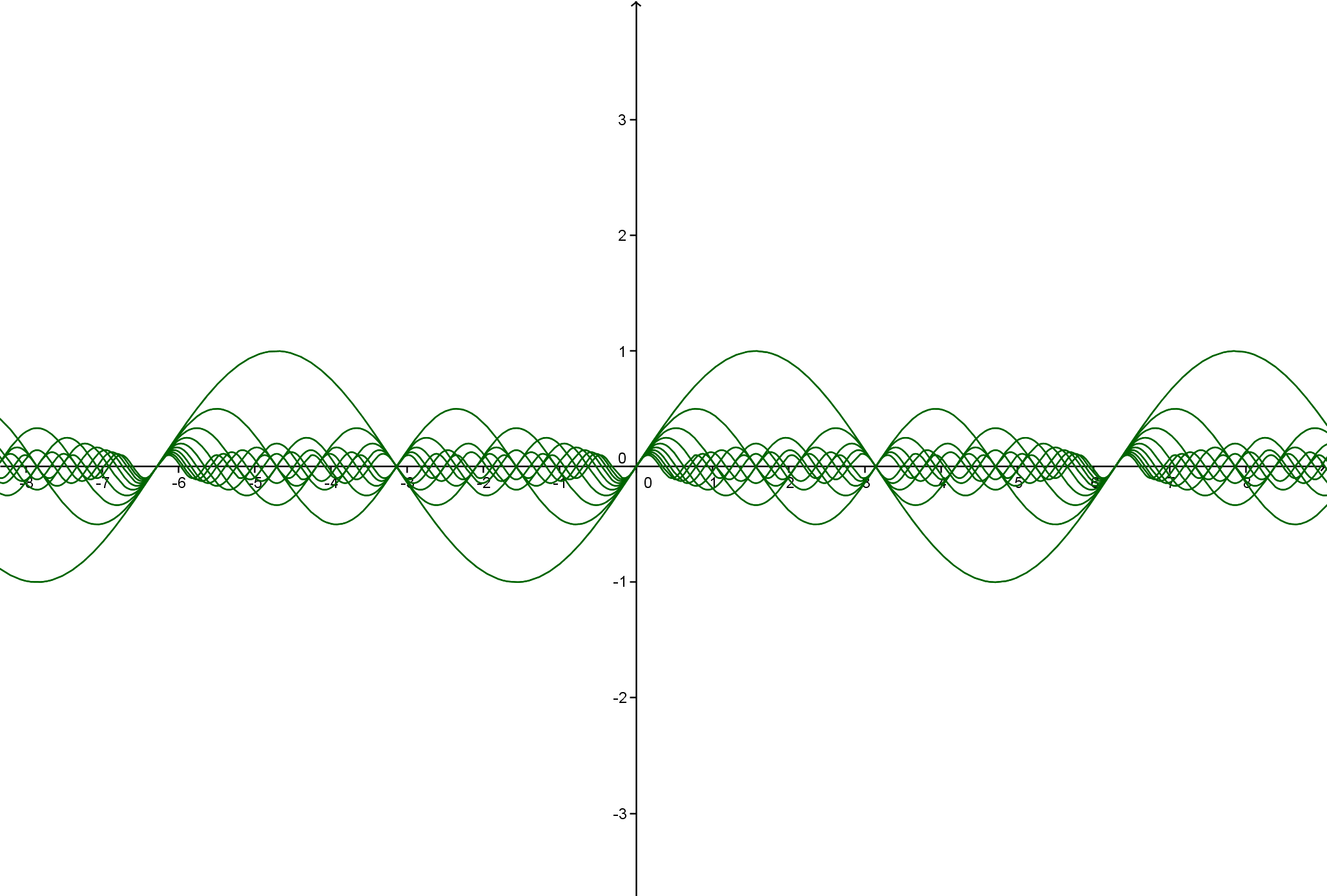
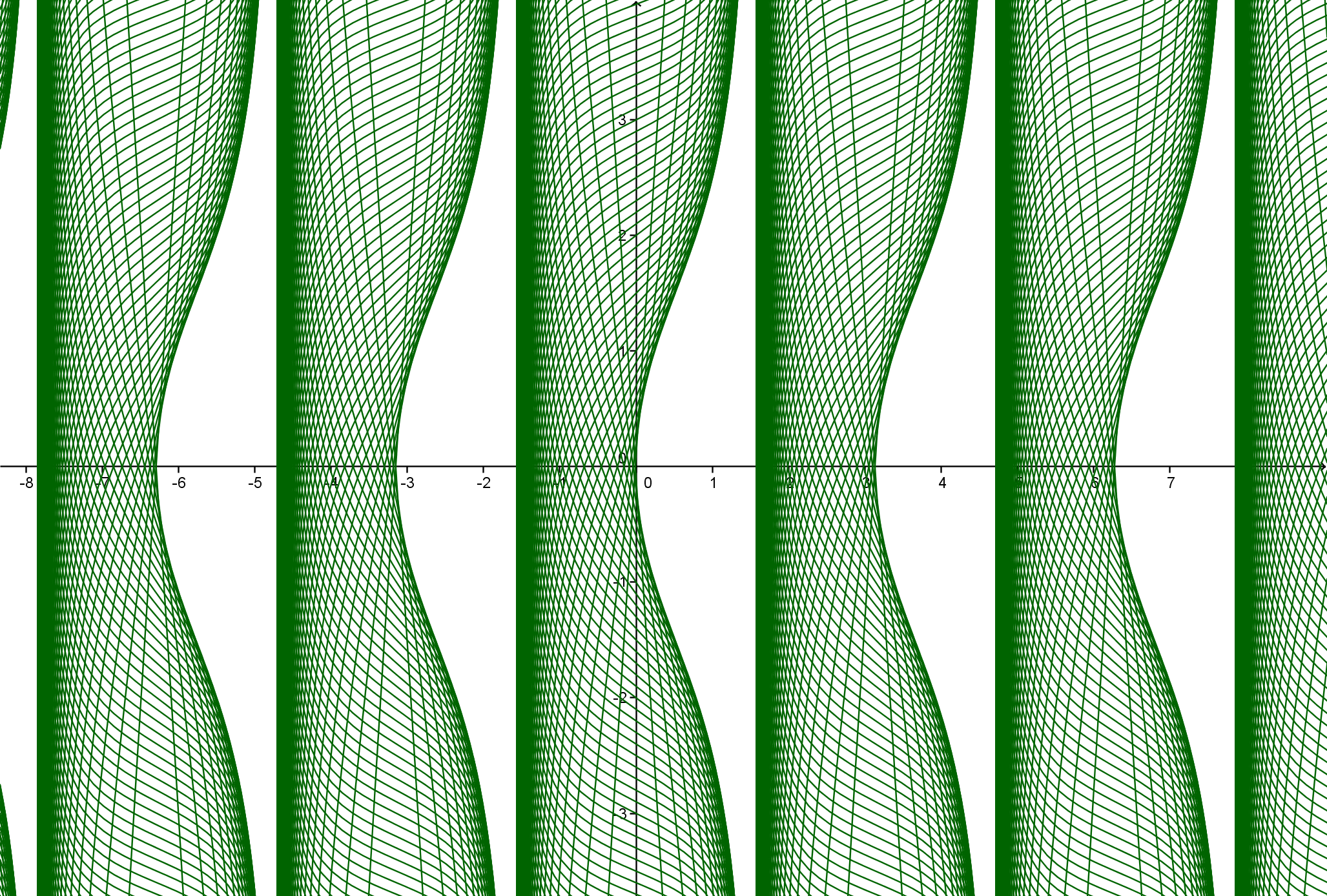
Sequence[1/k*tan(x)+k,k,-10,10,0.1]
Just kidding! I can’t stop! One more!

Sequence[k sec(x)+(1/k)*x,k,-10,10,0.25]
What I like about these pictures is…
THEY ARE PRETTY
THEY ARE FUN TO MAKE
THEY ARE SUPER EASY TO MAKE & TINKER WITH
THEY MAKE ME WANT TO MAKE MOAR AND MOAR AND MOAR
And then, if you’re me, they raise some questions… Why do they look like they do? What is common to all the curves (if anything)? Does something special happen when switches from negative to positive? What if I expanded the range of values? What if I plotted the family of curves but with an infinite number of values? Do the edges form a curve I can find? Can I make a prettier one? Can I change the coloring so that I have more than one color? What would happen if I added a second parameter into the mix? What if I didn’t vary by a fixed amount, but I created a sequence of values for instead? Why do some of them look three-dimensional? On a scale of 1 to awesomesauce, how amazingly fun is this?
You know what else is cool? You can just plot individual curves instead of the family of curves, and vary the parameter using a slider. Geogebra is awesome. Look at this .gif I created which shows the curves for the graph of the tangent function above… It really makes plain what’s going on… (click the image to see the .gif animate!)

Okay, so I’m not exactly sure what I’m going to do with this… but here’s what I’ve been mulling over. My kids know how to use geogebra. They are fairly independent. And I don’t want to “ruin” this by putting too much structure on it. So here’s where I’m at.
We’re going to make a mathematical art gallery involving families of curves.
1. Each student submits three pieces to the gallery.
2. Each piece must be a family of curves with a parameter being varied — but causing at least two transformations (so  won’t count because it just involves a vertical stretch, but
  would be allowed because there is a vertical stretch and horizontal shift).
3. At least one of the three pieces must involve the trig function(s) we’ve learned this year.
4. The art pieces must be beautiful… colors, number of curves in the family of curves, range for the parameter, etc., must be carefully chosen.
Additionally, accompanying each piece must be a little artists statement, which:
0. Has the title of the piece
1. States what is going on with each curve which allows the whole family of curves to look the way they do, making specific reference to function transformations.
2. Has some plots of some of individual curves in the family of curves to illustrate the writing they’ll be doing.
3. Has a list of things they notice about the graph and things they wonder about the graph.
At the end, I’ll photocopy the pieces onto cardstock and make a gallery in the room — but without the artist’s names displayed. I’ll give each student 5 stickers and they’ll put their stickers next to the pieces they like the most (that are not their own). I’ll invite the math department, the head of the upper school, and other faculty to do the same. The family of curves with the most stickers will win something — like a small prize, and for me to blow their artwork into a real poster that we display at the school somewhere. And hopefully the creme de la creme of these pieces can be submitted to the math-science journal that I’m starting this year.
Right now, I have a really good feeling about this. It’s low key. I can introduce it to them in half a class, and give them the rest of that class to continue working on it. I can give them a couple weeks of their own time to work on it (not using class time). And by trying to suss out the family of curves and why it looks the way it does, it forces them to think about function transformations (along with a bunch of reflections!) in a slightly deeper way. It’s not intense, and I’ll make it simple to grade and to do well on, but I think that’s the way to do it.
What’s also nice is when we get to conic sections, I can wow them by sharing that all conics are generated by  . In other words, conic sections all can be generated by a single equation, and just varying the parameter . Nice, huh?
PS. Since I am not going to do this for a few weeks, let me know if you have any additional ideas/thoughts to improve things!

 and
and  equivalent expressions?” I have something pulling me in that direction too, saying that must be part of the “big idea” but haven’t quite been able to incorporate.
 ? So elegant! So coming up with equivalent expressions using the unit circle would be amazing for me. Anyone out there have this already done?


 has a vertex of
  because you “switch the sign of the -2 and keep the 3.” Barf. (FYI: we haven’t done function transformations yet.) So I created this sheet to “guide” students to a deeper understanding of vertex form.
 and
and  . Students also had been exposed to the vertex form of these basic quadratics. But they hadn’t been exposed to quadratics where the coefficient in front of the
  term wasn’t “nice.” So all I did was give them four geogebra files, and had them play around. By the end of the activity, students recognized how critical the “a” coefficient was to the shape of the parabola, they started conjecturing that if you had the “a” value and the vertex and whether the parabola opens up/down that you could graph any parabola, and one pair of kids were able to convert a crazy angrybirds quadratic (with a really nasty “a”‘ value) to vertex form.
 and
and 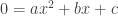 , which was the goal of the sheet. So it needs some refinement.
 we have to draw a 2D graph. Well, to be more specific, students could do the process but didn’t fully grasp why we graph
  . I changed up this worksheet this year, but maybe I should go back to last year’s worksheet.
 has a graph that looks like:
 , and the graph looks like:
 (obviously).
 . But the graphs are different.
 .
. . This was a good reminder for us.


